Related Articles


Does the user only need 50 milliseconds to form an opinion on any site? Web developers and designers really have very little time to make a good impression on a person when visiting a resource. That is why the correct design of the main page + website header , which everyone sees in the first place, is so important.
Click here : Website Designing Companies in UAE
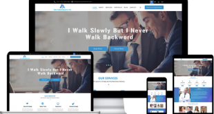
Many web projects on the network are united by one common way of attracting the attention of the audience – the use of bright colorful designs , in particular – placing a large background image or large banner at the top of the website. It is also called “hero image”.
Images
This “main image” is not just a beautiful illustration on the site to capture attention, it should become something more. Developers need to try to make a powerful visual communication tool that can increase sales and become the real “hero” of your online business. In our translation of the original article, you will find eight useful tips to help create the right hero image – one that would attract attention, help convert users into regular customers and would be a useful addition to the design of your website.
USE RELEVANT IMAGES
This is a very important point. Appropriate quality graphics will help to increase the overall rating of the site, while improperly selected illustration risks spoiling the whole impression of the design. When choosing a hero image, give preference to pictures that match the theme, content and idea of the site, for example, as done here . Otherwise, the hero image and content will be inconsistent – this will confuse the user and he will leave the site.
Relevant images
The materials from the photo stocks on the main page are already clichés. There is nothing wrong with them, but if you really want to quickly acquaint users with the main idea of your site, or do not want to be like many other companies, then you better avoid this approach. Basically, these are irrelevant pictures that do not cause much interest among users.
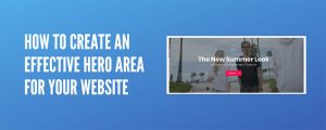
CREATE A DAZZLING MASTERPIECE FROM HERO IMAGE
As Saul Bass correctly said: “Design is visual thinking.” Indeed, this is the same content, only presented as an image. It allows you to highlight the content of a web page.The carefully thought-out hero image banner will please the eye and grab the attention of users. Take a look at this great example from Apple.
Image
Tip: the main picture should not present all the information, it is desirable to emphasize only the key and most important points.
TRY TO BE EMOTIONAL
According to surveys, in 70% of consumer loyalty and the decision to make a purchase is formed on the basis of emotions. If your graphic banner is endowed with individuality and plot, then it will definitely cause a response from visitors. Expressive, inspiring images turn an inanimate product or corporation into something that can evoke normal human feelings. Effective web design that reflects emotions is created primarily for people, and not for indicators, algorithms or search engine SEO robots. And this rule works in all cases – for goods, large companies or individual entrepreneurs.
Emotional design
Using emotion to connect with your audience is a great way to create a positive user experience that helps build consumer loyalty and brand confidence.
HIGH QUALITY GRAPHICS
Pictures should not be blurry or retouched. Poor quality photos look ugly, in addition, it is difficult for users to understand what is shown on them. The use of such options in web design indicates a lack of professionalism. The hero image banner is the face of your brand, so try to avoid using “pixelated” images (unless they are pixel art works).
High quality photo
Tip: if you do not want the pictures to look blurry, the best way is to use vector graphic editors such as Adobe Illustrator and others to design your site.
ADD CTA ITEMS TO IMPROVE CONVERSION PERCENTAGE
Most often, as a call to action (CTA), it is the buttons that are placed on top of the large image at the top of the screen that are used. It is very important to achieve a visual harmony between the hero image, the content and the CTA-button, especially if you are developing a landing page . When content is placed on top of a photo, web designers usually adjust its contrast or brightness. This is necessary so that the text / button is clearly visible.
CTA buttons
In the above example, hero image serves to support page heading, attracting the attention of users to the CTA element (by the way, the girl’s look is also directed towards the text block with a button). In addition, part of the background is intentionally darkened so that the white font is better visible.
USE CONTRASTS
One of our main tasks is to win the attention of visitors. A well-known iPod ad has skillfully used contrast to draw the attention of an audience to an audio player. A dark silhouette and white headphones stand out clearly against a light green background.
For more information visit our website Digital Marketing Services in UAE